Die cut pouches cannabis brands use should have a job beyond looking unusual. The shape should help customers remember the product, recognize the line, and understand the brand faster on a shelf. For some cannabis brands, that makes die-cut worth the added planning. For others, a standard stand-up pouch with stronger artwork will do more.
The real question comes down to value. Does the shape make the product easier to recognize? Does it support the brand idea? Does it still leave room for required product information?
If not, the custom shape may create more problems than upside.
When die cut pouches cannabis brands use make sense
Die-cut pouches make the most sense when the shape connects directly to the brand idea. For example, a fruit edible brand could use a peach silhouette. A premium flower brand could use a shield shape. A concentrate line could use a sharp gem-inspired pouch shape.
Because the outline changes before the customer reads the label, the package gets an extra recognition point. Color, logo, finish, and typography still matter. However, the silhouette can make the product easier to spot from a distance.
That matters most when a brand sells multiple SKUs. A standard pouch can carry the strain name and color system. A shaped pouch can turn the whole lineup into a stronger visual family. As a result, customers may remember the brand shape before they remember the exact flavor.
Custom shaped mylar bags versus standard pouches
Standard pouches win on simplicity. They stack well, fill easily, and give the designer a clean rectangle to work with. Also, they usually make the most sense for first runs, budget-conscious launches, and brands still testing demand.
Custom shaped mylar bags win when the format creates a clear retail advantage. The shape can support the product story before the customer gets close. For instance, a lightning-bolt pouch can fit a high-energy edible. A branded mascot silhouette can fit a lifestyle-driven flower line. A crown-shaped pouch can fit a luxury small-batch drop.
But shape should never carry weak branding. If the logo, color system, and front-panel hierarchy are unclear, a custom cut will not fix the design. In fact, it can make the layout harder to read.
Brand recognition starts with the silhouette
A strong pouch shape works like a shortcut. Before someone reads the strain name, they process the outline. Then they process the color, logo, and product details.
This is why shape-based branding has value. The package starts to act like a brand asset. Eventually, a repeat customer can recognize the product from the edge of the shelf or a social media photo.
However, the silhouette has to stay simple. A shape with too many small cuts can look messy after filling. It can also create weak points near the seal area. That is why clean outer shapes usually work better than overly detailed outlines.
Good die-cut pouch ideas include:
- A fruit shape for gummies or flavored edibles.
- A badge, shield, or crest for premium flower.
- A mascot head silhouette for character-based brands.
- A rounded cloud shape for soft lifestyle branding.
- A branded outline pulled from the logo mark.
Weak ideas include:
- Thin arms, spikes, or sharp extensions.
- Shapes that remove too much label space.
- Designs that make the warning area hard to place.
- Pouches that look good empty but awkward when filled.
Cost and MOQ realities for die-cut custom mylar bags
Die-cut custom mylar bags usually cost more than standard pouches. That extra cost comes from the custom shape work, tooling needs, waste, and production setup. Also, the unit cost can rise if the shape slows down cutting or packing.
At Beast Coast, the standard MOQ is 500 pieces. That gives smaller cannabis brands room to test a custom format before placing a large order. Still, brands should expect custom shapes to need more planning than a standard rectangle.
The better move is to design the shape around the sales plan. If the pouch supports a flagship SKU, limited drop, or hero edible line, the extra cost can make sense. If the product has no shelf strategy, the money may work better in artwork, better finishes, or stronger product photography.
Design constraints that matter before production
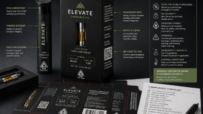
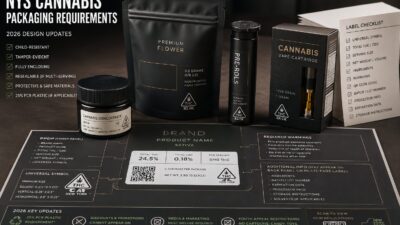
Die cut pouches cannabis brands create need enough flat surface for the actual design. The front panel must still hold the logo, product name, weight, potency details, warnings, and any state-required information.
Also, the pouch needs enough seal area. Cutting too close to the zipper, tear notch, or gusset can create problems. Need a hang hole, clear window, or child-resistant zipper? Then the shape has to leave room for those features.
That is why the artwork should not start as a wild shape. First, define the product size and required information. Next, map the usable print area. Then build the silhouette around the content.
Brands should also avoid placing important text near the outer edge. During cutting and sealing, tiny shifts can happen. Because of that, safe zones matter more on shaped pouches than standard pouches.
Product types that benefit most from die-cut pouches
Edibles often get the most value from custom shapes. Gummies, chocolates, candy-style products, and fruit flavors already rely on visual appetite cues. So a shape tied to flavor can help the product feel more ownable.
Flower can also work, especially for premium drops. However, flower brands should use shape carefully. A clean crest, badge, or brand icon shape often feels stronger than a literal cannabis leaf.
Pre-roll multipacks can benefit when the shape supports a lifestyle concept. For example, a racing-themed brand could use a compact badge shape. A music-driven brand could use a speaker-inspired silhouette. Still, the pouch must protect the product and stay easy to display.
Concentrates and vapes usually need more caution. These products often use boxes, jars, tubes, or smaller pouch formats. As a result, a die-cut pouch should only happen when it adds clear retail value.
Real examples of custom pouch shape ideas
A leaf-shaped pouch can work for a brand that wants an obvious cannabis cue. However, it can also feel generic because many brands reach for the same idea. If the leaf shape does not connect to a deeper brand system, it may look like a gimmick.
A branded silhouette usually works better. For example, a brand with a wolf logo could build a pouch outline around a wolf head. A surf brand could use a wave-shaped top edge. A dessert edible brand could use a bite-mark corner or soft scoop shape.
Also, shape can stay subtle. A standard pouch with a custom top contour can feel more premium than a fully irregular pouch. This approach keeps more label space while adding a unique edge.
When standard pouches are the better choice
Standard pouches are better when the brand still needs to prove demand. They also work better when compliance text, strain details, or product education need more room. Plus, they make more sense when a brand has many SKUs and wants clean operational consistency.
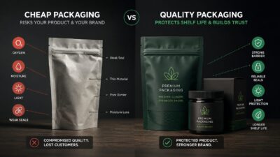
A standard pouch does not have to feel basic. Matte film, soft touch, foil, spot UV, clear windows, and stronger design hierarchy can make a standard pouch feel premium. In many cases, those upgrades do more than a custom cut.
So the decision should be simple. Choose shape when the outline strengthens the brand. Choose standard when readability, speed, cost, and flexibility matter more.
Get a quote for die cut pouches cannabis brands can actually use
Die cut pouches cannabis brands order should look strong, fill cleanly, and leave room for required information. Beast Coast can help with custom mylar bags, die-cut formats, print finishes, and packaging design support.
Need help deciding between a standard pouch and a custom shape? Send your product details, size, artwork, and brand direction. Then the team can recommend a format that fits the product, budget, and shelf strategy.